Data visualization has a rich history, with notable examples like Charles Minard’s map depicting Napoleon’s disastrous Russian campaign (see below). In modern times, data visualization has become increasingly important, particularly in the age of big data. Open-source tools like R and Python have democratized data visualization, allowing anyone to create compelling visualizations.

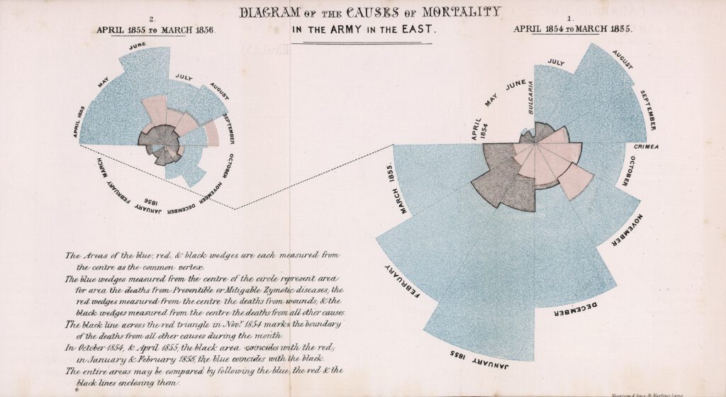
Another notable example of data visualization is Florence Nightingale’s polar area diagram, which illustrated the significant number of deaths among British soldiers due to preventable diseases during the Crimean War.
One influential concept in data visualization is „The Grammar of Graphics“ proposed by Leland Wilkinson. This framework provides a structured approach to creating visualizations, emphasizing the importance of mapping data to visual elements and carefully choosing appropriate scales and axes.
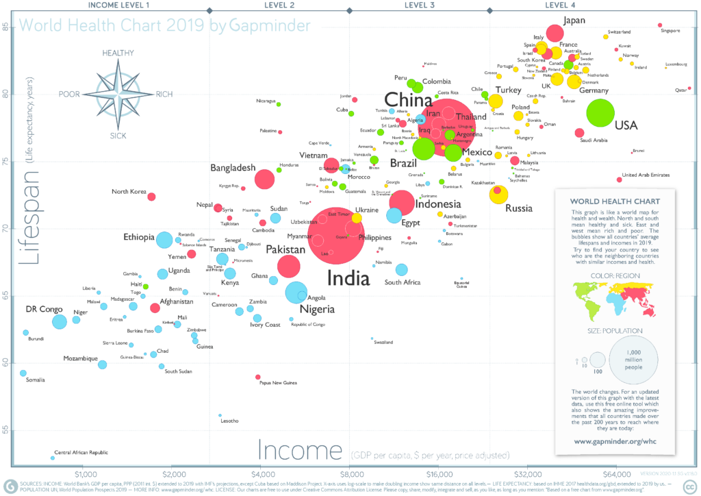
Hans Rosling’s „Gapminder“ software, which visualized global health and economic data, is a modern-day example of powerful data visualization in action, employing the principles laid down in „The Grammar of Graphics“ in an exemplary manner.
Today, data visualization continues to evolve, with new tools and techniques emerging all the time. However, the importance of using data visualization to effectively communicate complex ideas remains as relevant as ever.